Sunday, March 8, 2020
Year List - MASTER LIST
Birds
Black-Capped Chickadee
Northern Cardinal
American Robin
Woodpeckers
Downy Woodpecker
Sparrows
White-Throated Sparrow
- White Crowned
- Tan Crowned
Dark-Eyed Junco
American Tree Sparrow
Ducks
Greater Scaup
Redhead
Red-breasted Merganser
Common Goldeneye
Mammals
Fox Squirrel
Year List - 2020 - March 1 Edition
March 1, 2020
Location: Bill Jarvis Bird Sanctuary and surrounding parkland.
 Common Goldeneye
 (male)


Common Goldeneye
(female)


Black-Capped Chickadee

Redheads (with a Greater Scaup)

Greater Scaup (males with white side patch, females with white patch on beak)


Fox Squirrel/ Eastern Fox Squirrel/Bryant's Fox Squirrel
Also seen: northern cardinal; White-Throated Sparrow
Location: Bill Jarvis Bird Sanctuary and surrounding parkland.
 Common Goldeneye
 (male)

Common Goldeneye
(female)


Black-Capped Chickadee

Redheads (with a Greater Scaup)

Greater Scaup (males with white side patch, females with white patch on beak)


Fox Squirrel/ Eastern Fox Squirrel/Bryant's Fox Squirrel
Also seen: northern cardinal; White-Throated Sparrow
Year List - 2020 - March 8 edition
Going to try the year list again this year...
March 8, 2020
Location: Bill Jarvis Bird Sanctuary and surrounding parkland.
 The lighting was seriously not in my favor, but this appears to be a Red-Headed Merganser.

Common Goldeneye (female)


 Dark-Eyed Junco

 American Tree Sparrow
(right - female; left - male)


 Northern
Cardinal
(left - male)
(right - female)

 White-Throated Sparrow
(White-capped variation)

 White-throated Sparrow (Tan-capped variation)

 Downy Woodpecker (Eastern, female)


American Robin
March 8, 2020
Location: Bill Jarvis Bird Sanctuary and surrounding parkland.
 The lighting was seriously not in my favor, but this appears to be a Red-Headed Merganser.
Common Goldeneye (female)


 Dark-Eyed Junco
 American Tree Sparrow
(right - female; left - male)


 Northern
Cardinal
(left - male)
(right - female)

 White-Throated Sparrow
(White-capped variation)

 White-throated Sparrow (Tan-capped variation)
 Downy Woodpecker (Eastern, female)

American Robin
Sunday, April 28, 2019
Hamilton Exhibition - Post Two - Themes, Text Clues and The One Thing That Bugged Me
First of all... start here if you haven't read the post about what went on before the show.
And now... Themes, Text Clues and One Thing That Bugged Me.
The Exhibition is set up on a long, twisting path that takes you through different galleries and environments. There are spots where they gather up about 50 visitors and have us all sit and experience the same thing at the same time, but for the most part you wander through on your own, and at your own pace.
If you've ever been to DisneyWorld or Universal where they know people will be standing in really, really long lines for a ride, you kind of know the set up. The line wanders through rooms and settings with animatronic depictions of different scenes and music plays so that people have something to look at while they wait to get to the main attraction. Only, in this case, what you see in the line IS the main attraction.
The staff will tell you that it takes about 90 minutes. Um... no. Not if you actually want to read everything they have and listen to all the narration. I went in at 10:11.

I came out exactly three hours later. So, double the expected time to get through everything.


 They even tell you to look for these frames where they point out where things had to be altered to fit into the narrative of the musical better.

 This is the only time the quotes are tagged, but the 'handwriting' would let you know, throughout the exhibition, that you were looking at words that Hamilton really wrote or said about the events in that room. Also... that's one seriously sophisticated 12 year old.
 In many cases the quotes were just 'burning' through a black background on the wall, but they also tended to pop up in appropriate contexts.
 The more I learn about the actual history between Burr and Alexander (and the more I listen to the original version of "Your Obedient Servant"), the more I'm amazed that it took as long as it did for Burr to shoot Hamilton. This quote led you into the room that depicted the duel. If you didn't understand why Burr had had it with Hamilton before, you started to get a pretty clear picture with this quote.

So this was in the room that covered Alexander's childhood up to the Hurricane. You'll notice that these lyrics are in a much more contemporary 'typewriter' font.

 Because the show goes in chronological order and most of "Hurricane" is a flashback, this was on the way out of the Hurricane scene, which is the second room.
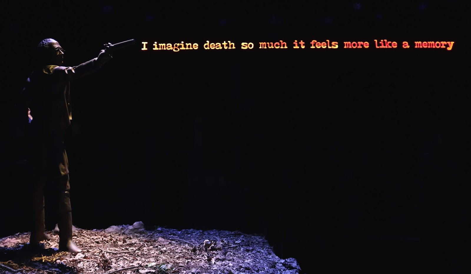
And then there was this (which I spent WAY too much time lining up the statue and the text) in the Duel room. I'll talk more about this in the post about Act II.
 These would pop up as parts of displays in some really interesting ways.
 My first instinct was that the text was light shining onto the surface, like in this case the base of the pillars. But I noticed after a while that people never got in the way of the lights. So they had to be cut out of the set piece and lit from inside.
 Which I found kind of fascinating when it seemed to be coming out of what I would have assumed was a solid 4x4 beam.
And now for the one thing that bugged me... For a show that is so meticulously created and that focuses so much on text and writing... there were some grammar errors in the signs! And, sure in the actual Hamilton quotes, it would be easy to let them go because English didn't get codified until well after his death.
 But in the lyrics, I would have expected simple English conventions like periods at the end of a full thought.

Or an ellipses if the thought is being truncated.

 Or a semi-colon when two full, but related thoughts are connected.
And it wasn't a style choice, because most of the time they got it exactly right.


The last thing I want to point out before going through the exhibition chronologically were some of the really cool extended metaphors.
Several times, ink is a metaphor for blood.
 Here's it's being used to show the vitriol between... well, everyone involved in the election of 1800.

 There's a long (and IMHO fairly belabored) comparison of Washington's administration to a circus that I wasn't a huge fan of.
 Not that they didn't execute it well, and not that I don't believe there was more than a little chaos caused by the friction between Hamilton and Jefferson... but to me it was a bit over the top.
The last really cool motif I want to point out was this idea that you were literally walking through not only the time, but the words that shaped these events. They call it a "360 degree immersive event" and it really is.

 You literally walk through the Declaration of Independence, with the text on the walls and the signatures on the ceiling.
 You walk through all the writings that got Alexander in trouble towards the end of his life including the Reynolds Pamphlet and that scathing commentary on John Adams that gets summarized as, "Sit down, John, you fat motherfucker!" in the show.

 There are things to look at on every wall, on the ceilings and on the floors.
And now... Themes, Text Clues and One Thing That Bugged Me.
The Exhibition is set up on a long, twisting path that takes you through different galleries and environments. There are spots where they gather up about 50 visitors and have us all sit and experience the same thing at the same time, but for the most part you wander through on your own, and at your own pace.
If you've ever been to DisneyWorld or Universal where they know people will be standing in really, really long lines for a ride, you kind of know the set up. The line wanders through rooms and settings with animatronic depictions of different scenes and music plays so that people have something to look at while they wait to get to the main attraction. Only, in this case, what you see in the line IS the main attraction.
The staff will tell you that it takes about 90 minutes. Um... no. Not if you actually want to read everything they have and listen to all the narration. I went in at 10:11.

I came out exactly three hours later. So, double the expected time to get through everything.
Now, to be fair, this is a very photo friendly exhibition, so I probably took a little longer than the average visitor. I also wanted to read, listen to and see everything. And there is a LOT of text in this place. If you're planning to attend with someone with low vision, a reading disability or with small children, it would be worth it to investigate if they have additional audio support for the sheer amount of general text in the place. There's also a lot of text in low light if that's a concern for people with vision issues. I found that taking pictures of some of it with my phone so that I could adjust the size and/or contrast helped when it was too small or too dark.
Also, there are times when the narration kicks in right when you've reached a display and you're trying to read the information printed at or around it. Unless you've got a Hamilton-esque brain and can process and comprehend two separate sets of information - one auditorily and one visually - at the same time, you may want to just let the narration run and then read. You don't need one piece of information in order to understand the other.
Speaking of photo friendly, I was amazed that they were perfectly okay with photography (no flash, for obvious reasons) everywhere except the first film/gallery, the Yorktown scene and the last film/gallery.
The tour starts with a video introduction by Lin-Manuel Miranda and Philipa Soo. I got away with photos while the 'screen saver' ran as everyone got seated.


They explain that there was a lot of history left out of the play (after all they covered 49 years in 2 and a half hours) and that there were some liberties taken to make the history more "musical friendly." The exhibition would walk through the events highlighted in the show, adding in more details than the play could allow for and would highlight some of the places where things had to get changed to make it work on stage.
 They even tell you to look for these frames where they point out where things had to be altered to fit into the narrative of the musical better.
Which leads us to the text. There is so much done with not just the words, but the style of the text that gives you clues as to 'where you are' in the play as you go.
First, there were two kinds of signs showing up periodically to help you understand what the gallery was about.
One was done in a very 18th century style calligraphic font. The first one of these was tagged as Alexander Hamilton's own words. From then on out, you just needed to see the calligraphy to know that what you were reading was Hamilton's own words, not lines from the play.
 This is the only time the quotes are tagged, but the 'handwriting' would let you know, throughout the exhibition, that you were looking at words that Hamilton really wrote or said about the events in that room. Also... that's one seriously sophisticated 12 year old.
 In many cases the quotes were just 'burning' through a black background on the wall, but they also tended to pop up in appropriate contexts.
 The more I learn about the actual history between Burr and Alexander (and the more I listen to the original version of "Your Obedient Servant"), the more I'm amazed that it took as long as it did for Burr to shoot Hamilton. This quote led you into the room that depicted the duel. If you didn't understand why Burr had had it with Hamilton before, you started to get a pretty clear picture with this quote.
The other quotes you'd see periodically came from the lyrics. Also, with the narration being periodic, there was an instrumental version of the song that covered the same period of time playing in the background in each room.

So this was in the room that covered Alexander's childhood up to the Hurricane. You'll notice that these lyrics are in a much more contemporary 'typewriter' font.

 Because the show goes in chronological order and most of "Hurricane" is a flashback, this was on the way out of the Hurricane scene, which is the second room.
And then there was this (which I spent WAY too much time lining up the statue and the text) in the Duel room. I'll talk more about this in the post about Act II.

 My first instinct was that the text was light shining onto the surface, like in this case the base of the pillars. But I noticed after a while that people never got in the way of the lights. So they had to be cut out of the set piece and lit from inside.
And now for the one thing that bugged me... For a show that is so meticulously created and that focuses so much on text and writing... there were some grammar errors in the signs! And, sure in the actual Hamilton quotes, it would be easy to let them go because English didn't get codified until well after his death.
 But in the lyrics, I would have expected simple English conventions like periods at the end of a full thought.
Or an ellipses if the thought is being truncated.

 Or a semi-colon when two full, but related thoughts are connected.
 And it wasn't a style choice, because most of the time they got it exactly right.


The last thing I want to point out before going through the exhibition chronologically were some of the really cool extended metaphors.
Several times, ink is a metaphor for blood.
 Here's it's being used to show the vitriol between... well, everyone involved in the election of 1800.
And here it is again right before the Duel, referencing the letters "Your Obedient Servant" is based on.
 There's a long (and IMHO fairly belabored) comparison of Washington's administration to a circus that I wasn't a huge fan of.
  Not that they didn't execute it well, and not that I don't believe there was more than a little chaos caused by the friction between Hamilton and Jefferson... but to me it was a bit over the top.
The last really cool motif I want to point out was this idea that you were literally walking through not only the time, but the words that shaped these events. They call it a "360 degree immersive event" and it really is.

 You literally walk through the Declaration of Independence, with the text on the walls and the signatures on the ceiling.
  You walk through all the writings that got Alexander in trouble towards the end of his life including the Reynolds Pamphlet and that scathing commentary on John Adams that gets summarized as, "Sit down, John, you fat motherfucker!" in the show.
 There are things to look at on every wall, on the ceilings and on the floors.
There is something written on every available surface, which makes sense given the subject of the show and is another extended metaphor. Talk about "Why do you write like you're running out of time?"
In my next two posts, I'll cover the major events covered in Act I and Act II.
Subscribe to:
Posts (Atom)